Choosing the right colour for your office furniture can reduce employee stress by up to 20%, yet many UK procurement teams overlook this powerful tool when refurbishing workspaces. Colour psychology extends far beyond aesthetics, directly influencing mood, productivity, and even how comfortable your team perceives their ergonomic chairs and desks to be. This guide cuts through common misconceptions and provides practical steps to select furniture colours that genuinely enhance wellbeing, align with your brand, and support diverse working styles in 2026’s hybrid offices.
| Point | Details |
|---|---|
| Colour psychology impacts workplace performance | Different colours trigger distinct emotional and cognitive responses that directly affect stress levels and productivity. |
| Warm versus cool colours serve different functions | Cool tones reduce stress whilst warm hues boost energy, but overuse of either creates problems. |
| Colour influences ergonomic perception | Strategic colour contrast improves posture awareness and reduces visual fatigue in furniture. |
| Misconceptions lead to poor choices | Bright colours don’t universally spark creativity; effects vary by task type and individual preferences. |
| Practical selection requires balancing factors | Effective colour choices align psychological impact, ergonomic needs, branding, and hybrid work demands. |
Colour psychology examines how different hues affect human emotion and behaviour. In office environments, this science becomes particularly relevant when selecting furniture that employees interact with daily. Research demonstrates that warm colours such as red and orange can increase energy and alertness but may also raise anxiety levels if overused in office furniture.
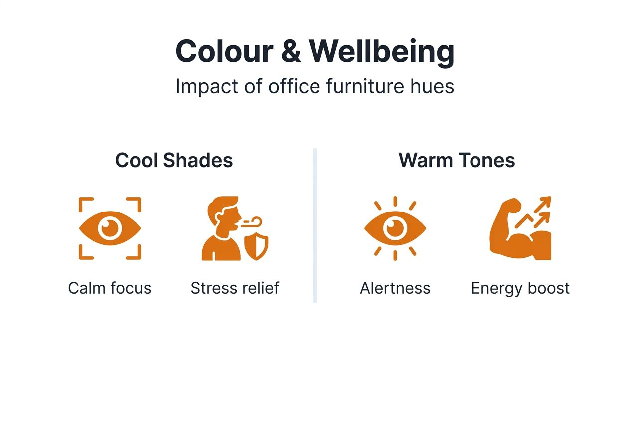
The connection between colour and workplace behaviour operates through both conscious and subconscious mechanisms. When your procurement team selects a blue ergonomic chair versus a red one, you’re not just choosing aesthetics. You’re influencing how relaxed or energised employees feel throughout their workday. Cool colours like blue and green typically slow heart rate and promote calmness. Warm colours have the opposite effect, stimulating activity and alertness.
For office furniture specifically, colour choices interact with ergonomic design to shape overall user experience. A well-designed task chair delivers proper lumbar support, but its colour influences whether users perceive it as comfortable and inviting. This dual impact means furniture colour selection deserves the same strategic consideration as specifications like adjustability and materials.
When evaluating furniture colours, consider three distinct frameworks:
Integrating these perspectives helps UK businesses make informed decisions that enhance workplace comfort with durable furniture whilst supporting employee wellbeing. Understanding colour psychology research provides the foundation for applying these principles practically.
Cool colours deliver measurable benefits for stress reduction in office settings. Studies show that cool colours like blue and green reduce physiological stress markers by up to 20%, making them excellent choices for furniture in high-pressure departments or roles requiring sustained concentration. Green particularly supports focus without causing fatigue, whilst blue promotes feelings of calm and stability.
Warm colours serve different functions in workplace environments. Red and orange increase alertness and can energise collaborative spaces or meeting rooms. However, excessive warm colours in individual workstations may elevate anxiety and reduce concentration over extended periods. The key lies in strategic placement rather than wholesale adoption.

Neutral colours like grey, beige, and white provide versatile foundations that support sustained focus without psychological distraction. They allow other design elements to stand out whilst maintaining visual harmony. Many successful UK office refurbishments combine neutral base furniture with selective warm or cool accents.
| Colour category | Primary psychological effects | Best applications | Potential drawbacks |
|---|---|---|---|
| Cool (blue, green) | Reduces stress, promotes calm, enhances concentration | Individual workstations, focus areas, analytical roles | May feel cold or uninviting if overused |
| Warm (red, orange, yellow) | Increases energy, stimulates creativity, boosts alertness | Meeting rooms, collaborative zones, break areas | Can raise anxiety, reduce focus in excess |
| Neutral (grey, beige, white) | Supports sustained attention, provides visual rest | Base furniture, open offices, versatile spaces | May appear bland without accent colours |
The relationship between colour and productivity isn’t universal. Task type significantly moderates these effects. Creative brainstorming sessions may benefit from energising warm tones, whilst data analysis work performs better with calming cool colours. Individual differences also matter, as personal colour preferences and cultural associations influence responses.
Pro Tip: Use warm accent colours selectively in active collaboration zones, pairing them with cool or neutral tones in individual work areas to balance energy and focus throughout your office.
When selecting office chair ergonomics solutions, consider how upholstery colour complements the chair’s physical comfort features. Scientific colour impact studies continue revealing nuanced effects that inform smarter furniture procurement.
Many office managers believe bright colours universally boost creativity and innovation. Reality proves more nuanced. Whilst certain bright hues may stimulate ideation in short bursts, they can overwhelm cognitive processing during complex problem-solving tasks. The notion that simply adding colourful furniture transforms workplace culture oversimplifies how colour psychology actually operates.
Another widespread misconception suggests colour effects remain consistent across all employees. Individual differences including personality, cultural background, and even age influence colour perception and preference. What energises one team member might distract or irritate another. Assuming uniform responses leads to furniture selections that satisfy some staff whilst undermining others’ comfort.
The belief that warm colours increase alertness without downsides persists despite evidence showing excessive use raises anxiety. Procurement teams sometimes choose bold red or orange furniture expecting pure productivity gains, only to discover increased stress complaints. Understanding the full spectrum of effects prevents these costly mistakes.
Some decision-makers dismiss colour as purely aesthetic, separate from functional furniture considerations. This ignores substantial evidence that colour influences perceived comfort, ergonomic satisfaction, and even how long employees maintain proper posture. Colour choices extend well beyond visual appeal into tangible wellbeing outcomes.
Key misconceptions to avoid:
Pro Tip: Survey your team’s colour preferences and work style needs before finalising furniture selections, then design flexible schemes that accommodate diverse responses rather than imposing a single palette.
Addressing these misconceptions helps UK businesses make evidence-based decisions about ergonomics and colour misconceptions. Consulting colour misconceptions research clarifies what colour can realistically achieve in office furniture contexts.
Colour contrast plays a surprisingly important role in ergonomic awareness. Colour contrast in furniture can improve posture awareness and reduce visual fatigue, helping employees maintain healthier positions throughout their workday. When chair upholstery contrasts with desk surfaces, users more easily perceive their body position relative to their workspace, supporting better alignment.
Perceived comfort differs from objective ergonomic support, yet both matter for employee satisfaction. Furniture colour influences how comfortable seating feels, even when physical specifications remain identical. Cool colours often enhance perceived comfort in chairs, whilst warm colours may make furniture feel less inviting for extended sitting. This psychological dimension complements mechanical ergonomic features.
Visual fatigue accumulates from prolonged exposure to harsh colour combinations or excessive brightness. Neutral furniture tones with appropriate contrast reduce eye strain compared to highly saturated colours or pure white surfaces. This becomes particularly relevant for height-adjustable desks and large work surfaces that occupy significant visual fields.
Strategic colour application enhances ergonomic furniture benefits:
The relationship between colour and ergonomics extends to functional wayfinding. Different coloured furniture can help delineate workspace zones, guiding employees toward areas designed for specific activities. This spatial organisation supports ergonomic variety by encouraging movement between sitting, standing, and collaborative postures throughout the day.
For comprehensive guidance, explore the ergonomic furniture comfort guide and review ergonomic colour effects evidence to understand how colour choices amplify your ergonomic furniture investment.
Aligning furniture colours with corporate brand palettes strengthens visual identity throughout your office. When meeting room chairs echo your brand’s primary colours, you create cohesive environments that reinforce company values with every client visit. This strategic alignment transforms functional furniture into subtle brand ambassadors that shape stakeholder perceptions.
Colour-brand integration delivers motivational benefits beyond aesthetics. Employees working in spaces that reflect company identity often report stronger organisational connection and pride. This psychological alignment can boost engagement, particularly when colour choices communicate values like innovation through bold hues or reliability through classic neutrals.
Successful UK office refurbishments demonstrate practical colour-brand harmony. Tech startups frequently adopt vibrant blues and greens in ergonomic seating to signal innovation whilst maintaining the calm focus their developers need. Professional services firms often choose sophisticated greys and navy tones that convey trustworthiness without sacrificing modern appeal.
| Priority focus | Colour selection approach | Primary benefits | Implementation considerations |
|---|---|---|---|
| Brand reinforcement | Match furniture to corporate palette | Strengthens visual identity, impresses clients | May limit psychological flexibility |
| Psychological optimisation | Prioritise mood and productivity effects | Enhances wellbeing, boosts performance | Requires balancing diverse needs |
| Balanced integration | Blend brand colours with psychological principles | Achieves multiple objectives simultaneously | Demands careful planning and testing |
Best practices for colour-brand alignment in ergonomic furniture:
Balancing aesthetic branding with functional colour psychology requires strategic thinking. The most effective approaches integrate both perspectives, ensuring furniture choices simultaneously strengthen brand presence and support employee wellbeing. This dual focus characterises sophisticated procurement decisions in 2026’s competitive UK business environment.
For broader workspace planning, the office furniture workflow guide offers complementary strategies for colour integration across different functional zones.
Hybrid work models demand furniture colour strategies that adapt to fluctuating occupancy and diverse work modes. When the same desk serves focused individual work one day and collaborative sessions the next, colour choices must support both scenarios without compromising either. Neutral base palettes with flexible accent colours provide this versatility.
Different zones within hybrid offices benefit from distinct colour approaches. Focus areas for deep work perform best with cool, calming tones that minimise distraction. Collaboration zones gain from energising warm accents that stimulate discussion. Touchdown spaces for quick tasks work well with neutral schemes that don’t demand psychological adjustment.
Employee satisfaction in hybrid settings correlates with workspace flexibility, including visual adaptability. Furniture that feels appropriate whether you’re working independently or meeting teammates supports smoother transitions between work modes. Colour plays a subtle but meaningful role in this adaptability, influencing how welcoming and functional spaces feel across different uses.
Combining cool and neutral palettes with selective warm accents creates balanced hybrid environments. This approach provides psychological stability through consistent base colours whilst allowing activity-specific energy modulation through strategic colour placement. The result accommodates diverse working styles without requiring extensive reconfiguration.
Implementing versatile colour strategies in shared office spaces:
The flexibility required for hybrid work extends to furniture itself. Selecting office chairs for hybrid work means considering both ergonomic adjustability and colour versatility to serve varied users and activities effectively.
Successful colour selection follows a structured process that balances multiple factors systematically. Begin by evaluating your workspace functions and identifying primary activities in different zones. Administrative areas requiring sustained concentration need different colours than creative studios or client-facing meeting rooms.
Assess your team’s specific needs through surveys or focus groups. Ask about colour preferences, work style requirements, and any sensitivities to particular hues. This input prevents mismatches between furniture selections and actual user needs, improving satisfaction and adoption.
Balance psychological impact with ergonomic considerations by reviewing how colour choices affect both mood and physical comfort perception. A chair that looks comfortable encourages proper use of ergonomic features. Colours that reduce visual fatigue complement adjustability mechanisms that prevent physical strain.
Incorporate corporate branding colours thoughtfully rather than comprehensively. Select key brand hues for accent applications whilst maintaining psychological effectiveness through strategic neutral bases. This integration strengthens identity without overwhelming wellbeing objectives.
Test and adapt colour schemes specifically for hybrid work requirements. Pilot different colour combinations in actual work settings before committing to large orders. Gather feedback on how colours perform across various tasks and user groups, then refine selections accordingly.
Step-by-step colour selection process:
For detailed ergonomic guidance, consult resources on choosing office chairs in 2026, the comprehensive durable office furniture guide, and modern office furniture workflow planning.
Colour in office furniture extends far beyond decoration, directly influencing employee stress, productivity, and ergonomic comfort perception. Understanding how warm colours energise whilst cool tones calm, and recognising common misconceptions, empowers UK procurement teams to make evidence-based selections. Strategic colour choices that balance psychological impact, ergonomic needs, and corporate branding create workspaces that genuinely support wellbeing.
The rise of hybrid working in 2026 demands adaptable colour strategies that serve diverse activities and users. By following practical selection guidelines and testing colours in real work contexts, office managers can harness this powerful tool effectively. Thoughtful colour integration in furniture procurement represents a straightforward yet impactful investment in your team’s daily experience and long-term performance.
Ready to apply colour psychology principles to your workspace? Furniture For Business supplies UK businesses with ergonomic office furniture designed for both comfort and visual impact.
Our collections include ergonomic office chairs in diverse colour options that support wellbeing, height adjustable office desks that complement any palette, and comprehensive meeting room furniture solutions. Whether you’re refurbishing a single department or outfitting an entire office, we provide bulk order pricing and free UK mainland delivery to simplify procurement. Explore our range to find furniture that balances aesthetic appeal with evidence-based colour choices for productivity and staff satisfaction.
Colour influences emotional and cognitive responses through both conscious perception and subconscious mechanisms, directly affecting stress levels, alertness, and concentration. Appropriate colour choices create work environments that support positive mood states and sustained productivity throughout the workday.
Warm colours like red and orange increase energy and alertness, making them suitable for collaborative spaces, but excessive use can elevate anxiety. Cool colours such as blue and green promote calmness and reduce physiological stress markers, enhancing concentration for focused work.
Yes, strategic colour contrast between furniture components aids posture awareness and reduces visual fatigue during extended sitting. Colours also influence how comfortable furniture feels psychologically, complementing physical ergonomic features to enhance overall user satisfaction and proper equipment use.
Opt for flexible neutral base palettes with activity-specific accent colours that support both focused individual work and energetic collaboration. Test colour schemes with diverse users performing different tasks, ensuring selections accommodate fluctuating occupancy patterns and varied work modes effectively.
Phone: 0330 043 4114
VAT no. GB 991 8681 60
Company no. 07250570


